
Slides
The slideshow below should help explain 🥳
Slides are markdown rendered as slides with some special syntax to help define layouts.
Ask AI to create a slideshow on a topic
You can always ask AI to build a slide deck via MCP or directly on the workspace files (there is enough context for the model to know how to write a deck).
Hillnote ships with a Slide editor to build slides
The slide editor allows you to add new slides, insert images, define columns and more. 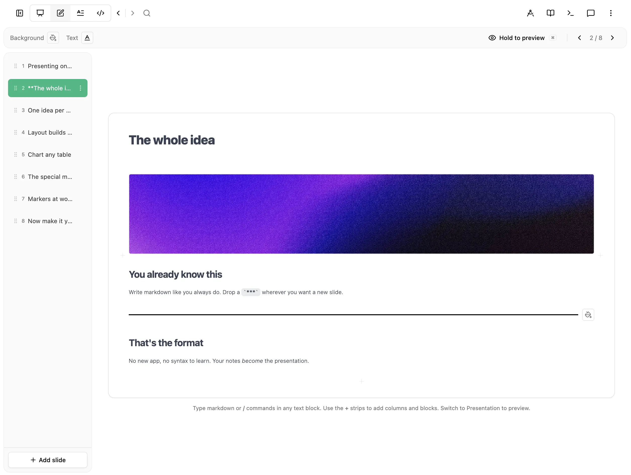
Slide example
Quick reference for Syntax commands
| Command | Syntax | Description |
|---|---|---|
| Slide separator | *** | Separates slides (three asterisks on its own line) |
| Vertical divider | ~ | Creates vertical sections with justify-between spacing |
| Inline media | ~inline | Keeps the next media block in the same column as preceding text |
| Split column | ~split | Forces the next text content into a new column |
| Split within column | ~split-column | Splits a column into stacked sub-blocks with independent styles |
| Column width | ~column{N}-{fraction} | Sets width of column N (e.g., ~column1-2/3) |
| Banner | ~banner | Makes content above it full-width, remaining content as columns below |
| Slide background | ~bg-{color/url} | Sets slide background (hex color or image URL) |
| Slide text color | ~text-{color} | Sets text color for the entire slide |
| Scoped text color | ~text-{target}-{color} | Sets text color for specific elements (h1, h2, h3, body) |
| Column background | ~bg-column-{color/url} | Sets background for the current column only |
| Column text color | ~text-column-{color} | Sets text color for the current column only |
| Scoped column text | ~text-column-{target}-{color} | Sets text color for specific elements in current column |
| Bar chart | ~bar | Renders the following table as a vertical bar chart |
| Line chart | ~line | Renders the following table as a line chart |
| Pie chart | ~pie | Renders the following table as a pie chart |
| Area chart | ~area | Renders the following table as an area chart |
| Visualization | ~visualize | Renders the following code block as live interactive HTML/SVG/JS |
| Horizontal line | ~line-horizontal | Adds a horizontal decorative line (append -{color} for custom color) |
| Vertical line | ~line-vertical | Adds a vertical decorative line (append -left/-right for alignment, -{color} for custom color) |
Hillnote Slide syntax Guide
A guide for creating slide presentations in Hillnote.
File Extension
Slide files use the .slides.md extension (e.g., my-presentation.slides.md). They are regular markdown documents that can be created, read, and edited using the standard document tools (create_document, read_document, edit_document).
File Structure
Slide files use markdown with a YAML frontmatter header:
***
type: slides
***

# Your First Slide

Content here...

***

# Second Slide

More content...
Slide Separators
Use *** (three asterisks) on its own line to separate slides.
The Column Rule
Slides use a simple column-based layout system:
- Text blocks stack vertically in one column (headings, paragraphs, lists, quotes, code, tables)
- Each image/video gets its own column
Examples:
text only              = 1 column
text + image           = 2 columns
text + image + image   = 3 columns
text + image + text    = 3 columns
image + image + image  = 3 columns
Cover Slides
The first slide of a presentation automatically becomes a cover slide if it contains only text (no images or videos), or text with a single trailing image. Cover slides feature:
- A beautiful gradient background (randomly selected from 8 options, or overridden with
~bg-) - Doubled H1 font size for impact
- Light font weight for elegance
- White text on the gradient
If the cover slide ends with an image, it renders as a 2/3 text + 1/3 image split layout:
# Welcome to My Presentation

A subtitle here

<img src="https://images.unsplash.com/photo-ID?w=800" alt="" loading="lazy" />
Slide Background — ~bg-
Use ~bg- on its own line to set the slide background. Supports hex colors and images:
~bg-1a1a2e

# Dark Background Slide

This slide has a solid #1a1a2e background.
~bg-https://images.unsplash.com/photo-ID?w=1920

# Image Background Slide

This slide has a full-bleed background image.
~bg-resources/images/hero.jpg

# Local Image Background

Uses a local workspace image as background.
Works on both cover slides (replaces the gradient) and regular slides.
Text Color — ~text-
Use ~text- on its own line to override text colors on a slide:
~text-ffffff— all text becomes white~text-h1-ffcc00— only H1 headings become gold~text-h2-00ff00— only H2 headings~text-h3-0000ff— only H3 headings~text-body-cccccc— paragraphs, lists, blockquotes, table cells
Granular overrides (~text-h1-, ~text-body-) take priority over the global ~text- directive. Combine with ~bg- for full control:
~bg-1a1a2e
~text-ffffff
~text-h1-ffcc00

# Gold Title on Dark Background

White body text here.
Column-Scoped Background & Text Color — ~bg-column- / ~text-column-
Use ~bg-column- and ~text-column- to apply background or text color to only the current column, not the entire slide. The directive applies to the column that follows it — it starts at the directive and ends when the column breaks (via ~split, a media block, or the end of the slide).
~bg-column-
## Light Column

Regular text here.

~split

~bg-column-1a1a2e
~text-column-ffffff

## Dark Column

This column has a dark background with white text.
Supports hex colors (~bg-column-1a1a2e) and images (~bg-column-resources/images/photo.jpg or ~bg-column-https://example.com/bg.jpg).
~text-column-
Works exactly like ~text- but scoped to the current column:
~text-column-ffffff— all text in this column becomes white~text-column-h1-ffcc00— only H1 headings in this column~text-column-body-cccccc— only body text in this column
Vertical Layout with Dividers
Use a single ~ on its own line to create vertical sections that spread apart using justify-between:
# Title at Top

~

Footer content at bottom
You can use multiple dividers to create multiple vertical sections:
# Top Section

~

Middle Section

~

Bottom Section
This works in both regular slides and cover slides.
Creating Slides
Write natural markdown and the layout adapts automatically based on content. See the Example Complete Presentation at the end of this guide for a full working example.
Auto-detected layouts:
- Cover: First slide with text only → gradient background, large title
- Title: Heading only → centered title slide
- Content: Heading + paragraphs → left-aligned content
- Bullets: Heading + list → bullet point slide
- Image Left/Right: Image + text → split layout (image position based on order)
- Quote: Blockquote → centered quote slide (H2 size for quote, body size for author with markdown support)
- Code: Code block → syntax-highlighted code slide (body text size)
- Table: Markdown table → formatted table slide
Layout Control Markers
~inline - Keep Media in Same Column
Use ~inline on its own line to keep the next media block in the same column as the preceding text (instead of creating a new column):
## Product Overview

Description of the product.

~inline

<img src="product.png" alt="Product" loading="lazy" />
Without ~inline: text + image = 2 columns
With ~inline: text + image = 1 column (image below text)
~split - Force Text into New Column
Use ~split on its own line to force the next text content into a new column (instead of stacking):
| Feature | Status |
|---------|--------|
| Alpha   | Done   |

~split

## Next Phase

| Feature | Status |
|---------|--------|
| Beta    | WIP    |
Without ~split: both tables stack in 1 column
With ~split: tables are in 2 separate columns
~column - Control Column Widths
Use ~column{N}-{fraction} on its own line to set the width of a specific column (1-based index):
~column1-2/3

## Main Content

Detailed explanation here with lots of text.

<img src="image.jpg" alt="Small sidebar image" loading="lazy" />
Without ~column1-2/3: text and image split 50/50
With ~column1-2/3: text takes 2/3, image takes 1/3
You can set multiple columns:
~column1-1/4
~column2-1/2

<img src="thumb.jpg" alt="Thumbnail" loading="lazy" />

## Center Content

Main content here.

<img src="side.jpg" alt="Side image" loading="lazy" />
Columns without an explicit ~column share the remaining space equally.
~split-column - Split a Column into Sub-Blocks
Use ~split-column on its own line to split a single column into two stacked sub-blocks. Each sub-block can independently accept ~bg-column- and ~text-column- directives, with styles only applying to the sub-block they appear within:
~bg-column-1a1a2e
~text-column-ffffff

## Dark Top Section

This sub-block has a dark background with white text.

~split-column

~bg-column-f0f0f0
~text-column-333333

## Light Bottom Section

This sub-block has a light background with dark text.
Without ~split-column: the entire column gets one background/text color
With ~split-column: each sub-block has its own background and text color
This is useful for creating visual contrast within a single column, such as a dark header area above a light content area.
~banner - Full-Width Row Above Columns
Use ~banner on its own line to make the content above it span full width, with the remaining content rendered as columns below:
## Key Metrics Dashboard

~banner

### Revenue

$2.4M this quarter

~split

### Users

12,500 active

~split

### Growth

+34% MoM
Without ~banner: heading would be in its own column alongside the metrics
With ~banner: heading spans full width on top, three metric columns below
This is useful for slides where you want a title or summary row spanning the full width, with detailed columns underneath.
~line-horizontal / ~line-vertical - Decorative Lines
Use ~line-horizontal or ~line-vertical on its own line to add a decorative line to your slide:
## Section Title

~line-horizontal

Some content below the line.
Append a hex color to customize the line color:
~line-horizontal-ff0000

~line-vertical-1a1a2e
Vertical lines support alignment with -left or -right:
~line-vertical-left

~line-vertical-right-ff0000
~line-horizontal— full-width horizontal line (default black)~line-horizontal-{color}— horizontal line with custom color~line-vertical— centered vertical line that stretches to fill height~line-vertical-left— left-aligned vertical line~line-vertical-right— right-aligned vertical line~line-vertical-left-{color}/~line-vertical-right-{color}— aligned with custom color
Lines are treated as text blocks and stack vertically with other content.
Charts (Optional - For Numeric Data Visualization)
Regular tables render as tables by default - no markers needed.
Only use ~bar, ~line, ~pie, or ~area when you want to convert a numeric data table into a visual chart:
~bar

| Quarter | Revenue |
|---------|---------|
| Q1      | 100     |
| Q2      | 150     |
| Q3      | 200     |
| Q4      | 280     |
When to use charts vs tables:
- Use a plain table (no marker) for text-based data, comparisons, feature lists, or any non-numeric information
- Use a chart marker only when you have numeric data that benefits from visual representation (trends, comparisons over time, proportions)
Available chart types:
~bar- Vertical bar chart (good for comparing categories)~line- Line chart (good for trends over time)~pie- Pie chart (good for showing proportions of a whole)~area- Area chart (good for cumulative trends)
Charts are treated as text blocks, meaning they stack vertically with other text content (headings, paragraphs, lists, etc.).
Mermaid Diagrams - To help make the deck visual
Mermaid diagrams are fully supported in slides for creating flowcharts, sequence diagrams, Gantt charts, and more. Simply use a standard mermaid code fence:
graph TD
    A[Start] --> B{Decision}
    B -->|Yes| C[Action 1]
    B -->|No| D[Action 2]
    C --> E[End]
    D --> E
Supported diagram types:
- Flowcharts -
graph TDorgraph LRfor process flows - Sequence diagrams -
sequenceDiagramfor interactions between components - Gantt charts -
ganttfor project timelines and schedules - Class diagrams -
classDiagramfor object-oriented structures - State diagrams -
stateDiagram-v2for state machines - Entity Relationship -
erDiagramfor database schemas - Pie charts -
piefor simple proportional data - Mind maps -
mindmapfor hierarchical ideas
Example Gantt chart:
gantt
    title Project Timeline
    dateFormat YYYY-MM-DD
    section Planning
    Requirements :a1, 2024-01-01, 7d
    Design       :a2, after a1, 5d
    section Development
    Backend      :b1, after a2, 14d
    Frontend     :b2, after a2, 14d
Mermaid diagrams are treated as text blocks and will stack vertically with other content. They automatically adapt to light/dark mode.
Interactive Visualizations
Use ~visualize before a code block to render it as a live, interactive HTML/SVG/JS visualization inside the slide. The code block is rendered in a sandboxed iframe that scales to fit the available space.
~visualize

```html
<div style="display: flex; align-items: center; justify-content: center; height: 100%;">
  <svg viewBox="0 0 400 200" style="max-width: 100%; max-height: 100%;">
    <circle cx="100" cy="100" r="60" fill="var(--accent)" opacity="0.5"/>
    <circle cx="200" cy="100" r="60" fill="#e03131" opacity="0.5"/>
    <circle cx="300" cy="100" r="60" fill="#2f9e44" opacity="0.5"/>
  </svg>
</div>
The visualization supports full HTML, CSS, and JavaScript. CSS variables are available for theme-aware styling:
- `--text-color` - adapts to light/dark mode
- `--bg` - background color
- `--muted` - muted text color
- `--border` - border color
- `--accent` - accent/highlight color

Use cases:
- **Interactive diagrams** - clickable flowcharts, decision trees
- **Data visualizations** - custom SVG charts, animated graphs
- **Calculators** - interactive tools with inputs and outputs
- **Animated illustrations** - CSS/JS animations explaining concepts

Visualizations are treated as text blocks and stack vertically with other content. They automatically adapt to light/dark mode via CSS variables and `postMessage`.

## Inline Formatting

Markdown formatting works within slides:
- `**bold text**` → **bold text**
- `*italic text*` → *italic text*
- `<mark>highlight</mark>` → highlighted text (yellow background)
- `` `code` `` → `code`
- `[link](url)` → clickable link

## Best Practices

1. **Keep slides focused** - One main idea per slide
2. **Use visuals** - Images and charts communicate faster than text
3. **Limit bullets** - 3-5 points maximum per slide
4. **Use raw markdown** - Layouts adapt automatically, no templates needed
5. **Use layout markers** - `~` for vertical spacing, `~inline` and `~split` for column control

## Images

Use Unsplash for high-quality, free images. Format: `https://images.unsplash.com/photo-ID?w=1280&h=720&fit=crop`

Example:
```markdown
<img src="https://images.unsplash.com/photo-1522071820081-009f0129c71c?w=1280&h=720&fit=crop" alt="Team collaboration" loading="lazy" />
Search Unsplash at https://unsplash.com to find relevant images, then copy the photo ID from the URL.
Videos
Embed YouTube or Vimeo videos using two syntax options:
Option 1: Image syntax with video URL
<img src="https://www.youtube.com/watch?v=VIDEO_ID" alt="Video Title" loading="lazy" />
<img src="https://youtu.be/VIDEO_ID" alt="Video Title" loading="lazy" />
<img src="https://vimeo.com/VIDEO_ID" alt="Video Title" loading="lazy" />
Option 2: YouTube shorthand
<div class="resource-youtube-container w-full my-6"><div class="aspect-video w-full"><iframe width="100%" height="100%" src="https://www.youtube.com/embed/VIDEO_ID" title="Video Title" frameborder="0" allow="accelerometer; autoplay; clipboard-write; encrypted-media; gyroscope; picture-in-picture; web-share" referrerpolicy="strict-origin-when-cross-origin" allowfullscreen class="w-full h-full rounded-lg"></iframe></div></div>
Videos are treated like images in the column system - each video gets its own column by default. Use ~inline to keep a video in the same column as text.
Example Complete Presentation
---
type: slides
---

13 March 2026

~

# Hillnote slides

An introduction to the new and improved slides feature in hillnote

~

Rajath bail

***

## Embedding ethics and accountability into every line of code

At NeuraCore, we believe that responsible AI is not a department, it's a discipline.

In 2025, we elevated our ethics and governance initiatives to ensure that every model we deploy reflects our values: fairness, inclusivity, and long-term societal benefit.

~

| Metric | Value |
| --- | --- |
| Increase in women in technical roles | 40% |
| Energy use from renewables | 30% |
| Profits earmarked for STEM education initiatives | 10% |

<img src="https://images.unsplash.com/photo-1600585154340-be6161a56a0c?w=800" alt="Interior" loading="lazy" />

***

## Connect and collaborate

Connect with your favourite AI models and tools to help you work in Hillnote.

~inline

<img src="hillnote-resource://%2FUsers%2Frajathbail%2FDesktop%2FWork%2FWorkspaces%2FHillnote%20Documentation%2Fresources%2Fimages%2F12-amazing-animal-facts%2F1762716977238.png" alt="" data-resource-path="resources/images/12-amazing-animal-facts/1762716977238.png" loading="lazy" />

~split

## Own your work

All files are saved locally using markdown, so your data is forever yours with no dependency on Hillnote.

~inline

<img src="hillnote-resource://%2FUsers%2Frajathbail%2FDesktop%2FWork%2FWorkspaces%2FHillnote%20Documentation%2Fresources%2Fimages%2FSecond%20blog%2F1764069809286.jpg" alt="" data-resource-path="resources/images/Second blog/1764069809286.jpg" loading="lazy" />

~split

## Craft your tools

Create powerful little programs to help you work using the AI assistant of your choice.

~inline

<img src="hillnote-resource://%2FUsers%2Frajathbail%2FDesktop%2FWork%2FWorkspaces%2FHillnote%20Documentation%2Fresources%2Fimages%2FScript%20test%2F1764586175427.png" alt="" data-resource-path="resources/images/Script test/1764586175427.png" loading="lazy" />

***

~column1-2/3

# Connect and collaborate

Connect with your favourite AI models and tools to help you work in Hillnote.

~inline

<img src="hillnote-resource://%2FUsers%2Frajathbail%2FDesktop%2FWork%2FWorkspaces%2FHillnote%20Documentation%2Fresources%2Fimages%2F12-amazing-animal-facts%2F1762716977238.png" alt="" data-resource-path="resources/images/12-amazing-animal-facts/1762716977238.png" loading="lazy" />

~split

## Own your work

All files are saved locally using markdown, so your data is forever yours with no dependency on Hillnote.

~inline

<img src="hillnote-resource://%2FUsers%2Frajathbail%2FDesktop%2FWork%2FWorkspaces%2FHillnote%20Documentation%2Fresources%2Fimages%2FSecond%20blog%2F1764069809286.jpg" alt="" data-resource-path="resources/images/Second blog/1764069809286.jpg" loading="lazy" />

## Craft your tools

Create powerful little programs to help you work using the AI assistant of your choice.

~inline

<img src="hillnote-resource://%2FUsers%2Frajathbail%2FDesktop%2FWork%2FWorkspaces%2FHillnote%20Documentation%2Fresources%2Fimages%2FScript%20test%2F1764586175427.png" alt="" data-resource-path="resources/images/Script test/1764586175427.png" loading="lazy" />

***

## A demonstration of our growth

~bar

| Quarter | Value |
| --- | --- |
| Q1 | 2 |
| Q2 | 6 |
| Q3 | 4 |

***

## ⚡ Charge Phase

Roll **2 dice** to generate your charges for the turn

~inline

~visualize

```html
<!DOCTYPE html>
<html>
<head>
<style>
  * { box-sizing: border-box; margin: 0; padding: 0; }
  body {
    font-family: system-ui, sans-serif;
    background: transparent;
    display: flex;
    align-items: center;
    justify-content: center;
    height: 100vh;
    padding: 16px;
  }
  .container { width: 100%; max-width: 560px; }
  .dice-row {
    display: flex;
    gap: 12px;
    justify-content: center;
    margin-bottom: 20px;
  }
  .die {
    width: 64px; height: 64px;
    border-radius: 14px;
    display: flex; align-items: center; justify-content: center;
    font-size: 2rem;
    font-weight: 800;
    cursor: pointer;
    transition: transform 0.15s;
    border: 3px solid var(--border, <span data-type="topic-tag" data-topic="e2e8f0" class="topic-tag text-emerald-600 dark:text-emerald-300 bg-emerald-50 dark:bg-emerald-900/30 px-1 rounded cursor-pointer hover:bg-emerald-100 dark:hover:bg-emerald-900/50 transition-colors" role="link" tabindex="0">#e2e8f0</span>);
    background: var(--bg, <span data-type="topic-tag" data-topic="fff" class="topic-tag text-emerald-600 dark:text-emerald-300 bg-emerald-50 dark:bg-emerald-900/30 px-1 rounded cursor-pointer hover:bg-emerald-100 dark:hover:bg-emerald-900/50 transition-colors" role="link" tabindex="0">#fff</span>);
    color: var(--text-color, <span data-type="topic-tag" data-topic="1a202c" class="topic-tag text-emerald-600 dark:text-emerald-300 bg-emerald-50 dark:bg-emerald-900/30 px-1 rounded cursor-pointer hover:bg-emerald-100 dark:hover:bg-emerald-900/50 transition-colors" role="link" tabindex="0">#1a202c</span>);
    user-select: none;
  }
  .die:hover { transform: scale(1.1); }
  .die.special {
    background: <span data-type="topic-tag" data-topic="6366f1" class="topic-tag text-emerald-600 dark:text-emerald-300 bg-emerald-50 dark:bg-emerald-900/30 px-1 rounded cursor-pointer hover:bg-emerald-100 dark:hover:bg-emerald-900/50 transition-colors" role="link" tabindex="0">#6366f1</span>;
    color: white;
    border-color: <span data-type="topic-tag" data-topic="4f46e5" class="topic-tag text-emerald-600 dark:text-emerald-300 bg-emerald-50 dark:bg-emerald-900/30 px-1 rounded cursor-pointer hover:bg-emerald-100 dark:hover:bg-emerald-900/50 transition-colors" role="link" tabindex="0">#4f46e5</span>;
  }
  .result-row {
    display: flex;
    gap: 16px;
    justify-content: center;
    margin-bottom: 20px;
  }
  .charge-box {
    flex: 1;
    border-radius: 14px;
    padding: 16px;
    text-align: center;
    border: 2px solid var(--border, <span data-type="topic-tag" data-topic="e2e8f0" class="topic-tag text-emerald-600 dark:text-emerald-300 bg-emerald-50 dark:bg-emerald-900/30 px-1 rounded cursor-pointer hover:bg-emerald-100 dark:hover:bg-emerald-900/50 transition-colors" role="link" tabindex="0">#e2e8f0</span>);
    background: var(--bg, <span data-type="topic-tag" data-topic="fff" class="topic-tag text-emerald-600 dark:text-emerald-300 bg-emerald-50 dark:bg-emerald-900/30 px-1 rounded cursor-pointer hover:bg-emerald-100 dark:hover:bg-emerald-900/50 transition-colors" role="link" tabindex="0">#fff</span>);
  }
  .charge-box .num {
    font-size: 2rem;
    font-weight: 900;
  }
  .charge-box .lbl {
    font-size: 0.75rem;
    font-weight: 700;
    text-transform: uppercase;
    letter-spacing: 0.06em;
    color: var(--muted, <span data-type="topic-tag" data-topic="718096" class="topic-tag text-emerald-600 dark:text-emerald-300 bg-emerald-50 dark:bg-emerald-900/30 px-1 rounded cursor-pointer hover:bg-emerald-100 dark:hover:bg-emerald-900/50 transition-colors" role="link" tabindex="0">#718096</span>);
    margin-top: 4px;
  }
  .minus .num { color: <span data-type="topic-tag" data-topic="ef4444" class="topic-tag text-emerald-600 dark:text-emerald-300 bg-emerald-50 dark:bg-emerald-900/30 px-1 rounded cursor-pointer hover:bg-emerald-100 dark:hover:bg-emerald-900/50 transition-colors" role="link" tabindex="0">#ef4444</span>; }
  .plus .num { color: <span data-type="topic-tag" data-topic="22c55e" class="topic-tag text-emerald-600 dark:text-emerald-300 bg-emerald-50 dark:bg-emerald-900/30 px-1 rounded cursor-pointer hover:bg-emerald-100 dark:hover:bg-emerald-900/50 transition-colors" role="link" tabindex="0">#22c55e</span>; }
  .rule-box {
    background: var(--bg, <span data-type="topic-tag" data-topic="fff" class="topic-tag text-emerald-600 dark:text-emerald-300 bg-emerald-50 dark:bg-emerald-900/30 px-1 rounded cursor-pointer hover:bg-emerald-100 dark:hover:bg-emerald-900/50 transition-colors" role="link" tabindex="0">#fff</span>);
    border: 2px solid var(--border, <span data-type="topic-tag" data-topic="e2e8f0" class="topic-tag text-emerald-600 dark:text-emerald-300 bg-emerald-50 dark:bg-emerald-900/30 px-1 rounded cursor-pointer hover:bg-emerald-100 dark:hover:bg-emerald-900/50 transition-colors" role="link" tabindex="0">#e2e8f0</span>);
    border-radius: 12px;
    padding: 14px 18px;
    font-size: 0.85rem;
    color: var(--text-color, <span data-type="topic-tag" data-topic="1a202c" class="topic-tag text-emerald-600 dark:text-emerald-300 bg-emerald-50 dark:bg-emerald-900/30 px-1 rounded cursor-pointer hover:bg-emerald-100 dark:hover:bg-emerald-900/50 transition-colors" role="link" tabindex="0">#1a202c</span>);
    line-height: 1.6;
  }
  .rule-box span { font-weight: 700; }
  .btn {
    display: block;
    margin: 0 auto 16px;
    padding: 10px 28px;
    background: <span data-type="topic-tag" data-topic="6366f1" class="topic-tag text-emerald-600 dark:text-emerald-300 bg-emerald-50 dark:bg-emerald-900/30 px-1 rounded cursor-pointer hover:bg-emerald-100 dark:hover:bg-emerald-900/50 transition-colors" role="link" tabindex="0">#6366f1</span>;
    color: white;
    border: none;
    border-radius: 10px;
    font-size: 0.95rem;
    font-weight: 700;
    cursor: pointer;
    transition: background 0.15s;
  }
  .btn:hover { background: <span data-type="topic-tag" data-topic="4f46e5" class="topic-tag text-emerald-600 dark:text-emerald-300 bg-emerald-50 dark:bg-emerald-900/30 px-1 rounded cursor-pointer hover:bg-emerald-100 dark:hover:bg-emerald-900/50 transition-colors" role="link" tabindex="0">#4f46e5</span>; }
</style>
</head>
<body>
<div class="container">
  <div class="dice-row" id="diceRow">
    <div class="die" id="d1">?</div>
    <div class="die" id="d2">?</div>
  </div>
  <button class="btn" onclick="rollDice()">🎲 Roll Dice</button>
  <div class="result-row">
    <div class="charge-box minus">
      <div class="num" id="minusCount">—</div>
      <div class="lbl">⚡ Minus Charges</div>
    </div>
    <div class="charge-box plus">
      <div class="num" id="plusCount">—</div>
      <div class="lbl">✨ Plus Charges</div>
    </div>
  </div>
  <div class="rule-box">
    🎲 Rolls <span>1–5</span> → gain that many <span style="color:#ef4444">− charges</span><br>
    🎲 Roll of <span>6</span> → gain <span style="color:#22c55e">1 + charge</span>
  </div>
</div>
<script>
function rollDice() {
  const r1 = Math.ceil(Math.random() * 6);
  const r2 = Math.ceil(Math.random() * 6);
  const faces = ['⚀','⚁','⚂','⚃','⚄','⚅'];
  const d1 = document.getElementById('d1');
  const d2 = document.getElementById('d2');
  d1.textContent = faces[r1-1];
  d2.textContent = faces[r2-1];
  d1.className = 'die' + (r1 === 6 ? ' special' : '');
  d2.className = 'die' + (r1 === 6 ? ' special' : '');
  let minus = 0, plus = 0;
  [r1, r2].forEach(r => { if (r === 6) plus++; else minus += r; });
  document.getElementById('minusCount').textContent = minus;
  document.getElementById('plusCount').textContent = plus;
}
</script>
</body>
</html>